Streamlining Navigation: a UX Overhaul for a Complex Partner Portal
Feb 17, 2024
Delivereasy
A redesign of a Partner Portal used to manage multiple stores, admin and reporting tasks. The goal was to make a complex, role-based system feel clearer, calmer, and less clunky — without breaking existing workflows. It was an opportunity to bring clarity to a messy system while setting foundations for what was coming down the line.
Role
UX Designer, Idea Generation, Wireframing, Prototyping, Brand Application
Tools
Figma & Plugins, FigJam, ChatGPT, Bulma CSS Framework, Mantine Core Components
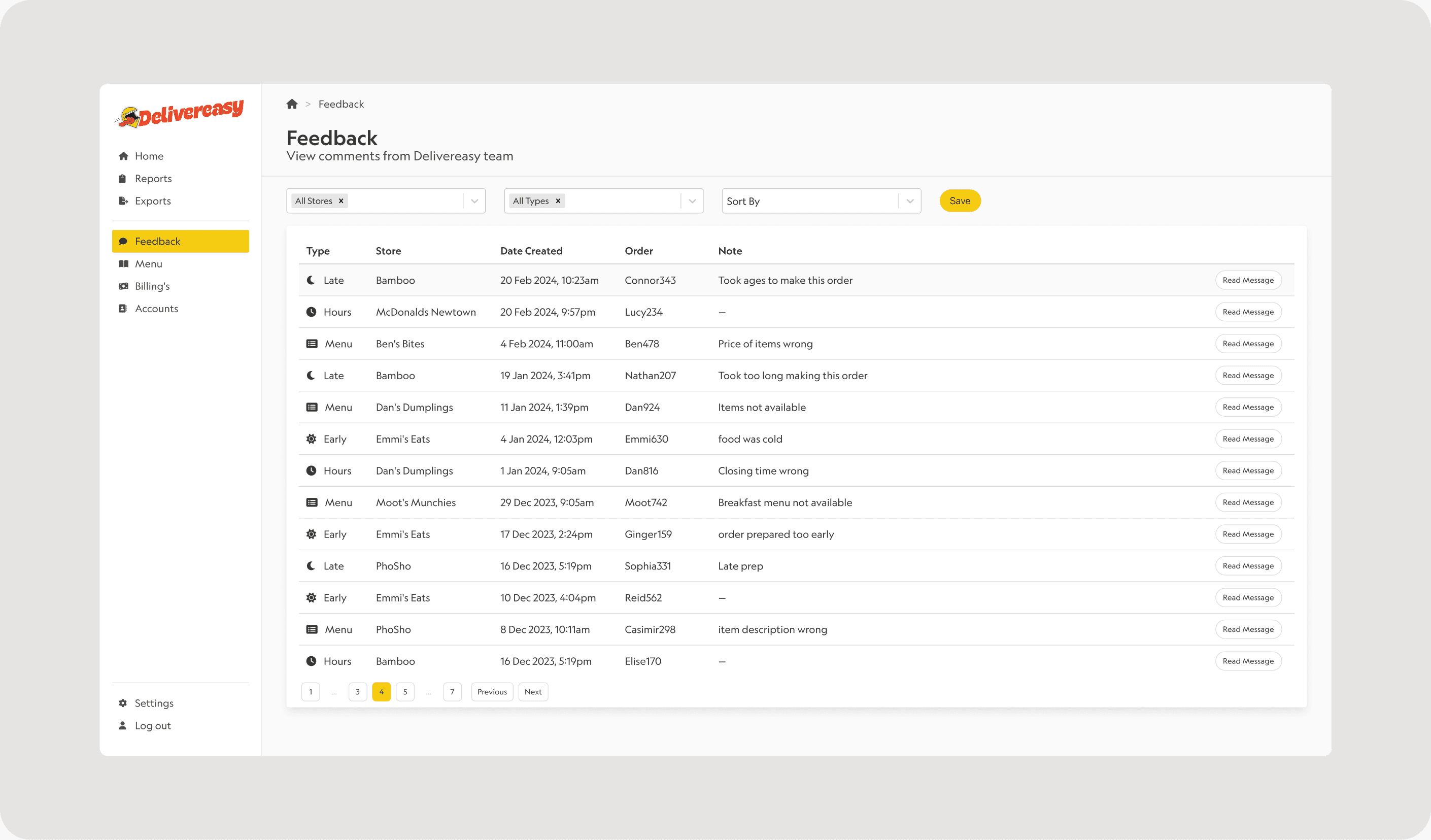
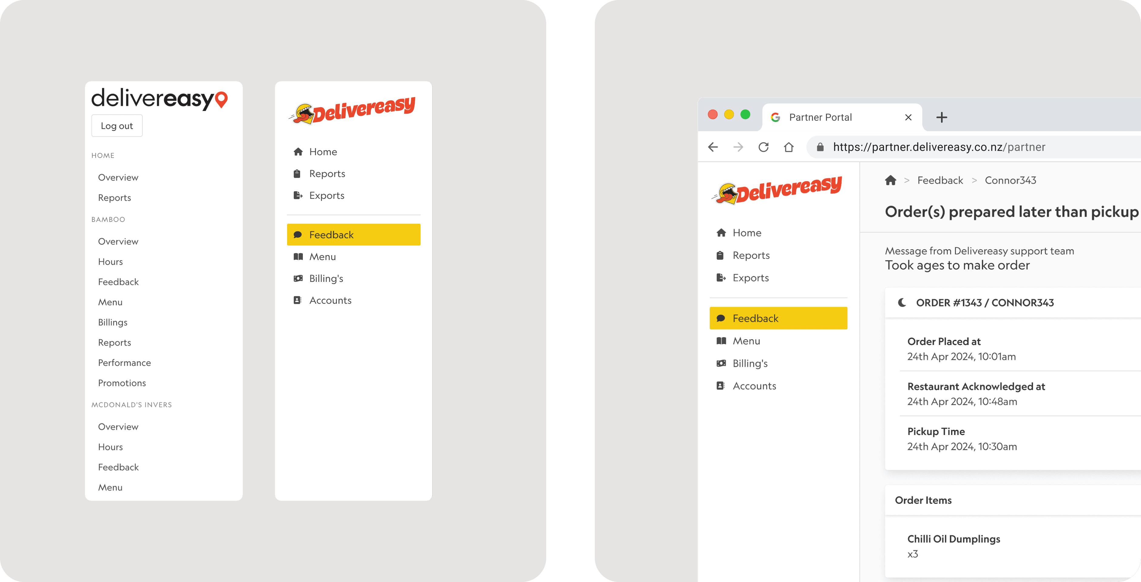
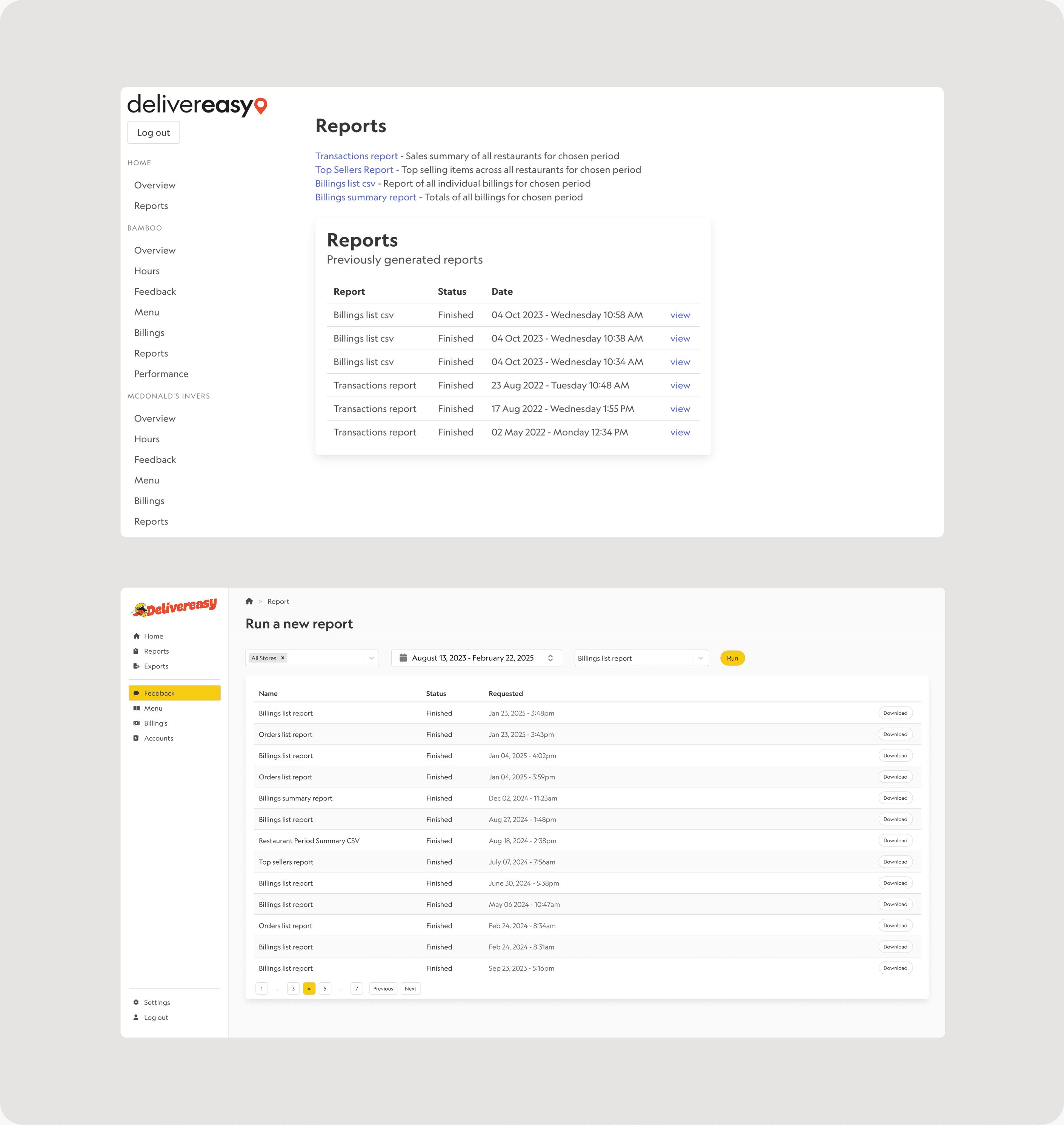
The Partner Portal had grown organically over time. Features were added as needed, navigation sprawled, and reporting tools became fragmented. The portal needed to support both single-store operators and large multi-store partners. Treating stores as a long, browsable list didn’t scale and made it unclear which stores actions applied to — increasing cognitive load and risk.
At the same time, the company had introduced new branding and was planning several backend and product changes, including a new exports system, future catalog editor, and the upcoming Metabase analytics integration.
Reframed store navigation
This wasn’t a sorting problem. It was a selection and intent problem. Partners weren’t trying to view stores — they were defining the scope of their work.
I redesigned store navigation around explicit context and intent, using filtering and active selection to clearly show which stores were in scope, with a safe default and easy reversal.
Why it matters
Reduced confusion, improved scalability, and made high-impact actions safer — especially for larger partners managing over 10 stores.
The outcome is a navigation model that scales, reduces ambiguity, and supports high-impact workflows with less mental overhead.