Managing Demand: Redesigning An Order System
Jan 13, 2025
Delivereasy
A redesign of a tablet-based order management system used by hospitality venues to manage incoming delivery and pickup orders. The goal was to make a fast-paced, operational tool feel clearer, more scalable, and easier to use during peak service — while supporting a shift to larger tablets and horizontal-first usage.
Role
Sole UX Designer, Interaction Design, Prototyping, Competitive Analysis
Tools
Figma & Plugins, FigJam, ChatGPT, Bulma CSS Framework, Mantine Core Components, Pen & Paper
The tablet experience had been designed for smaller screens and had grown organically over time. Orders required excessive scrolling, critical states were hard to distinguish, and too much information was shown by default — increasing cognitive load in already high-pressure environments.
The redesign improved visibility across active orders and made the system far more scalable for high-volume venues. It supports faster acknowledgment, clearer prioritisation, and safer handoff — while setting a stronger foundation for future tablet and workflow improvements.
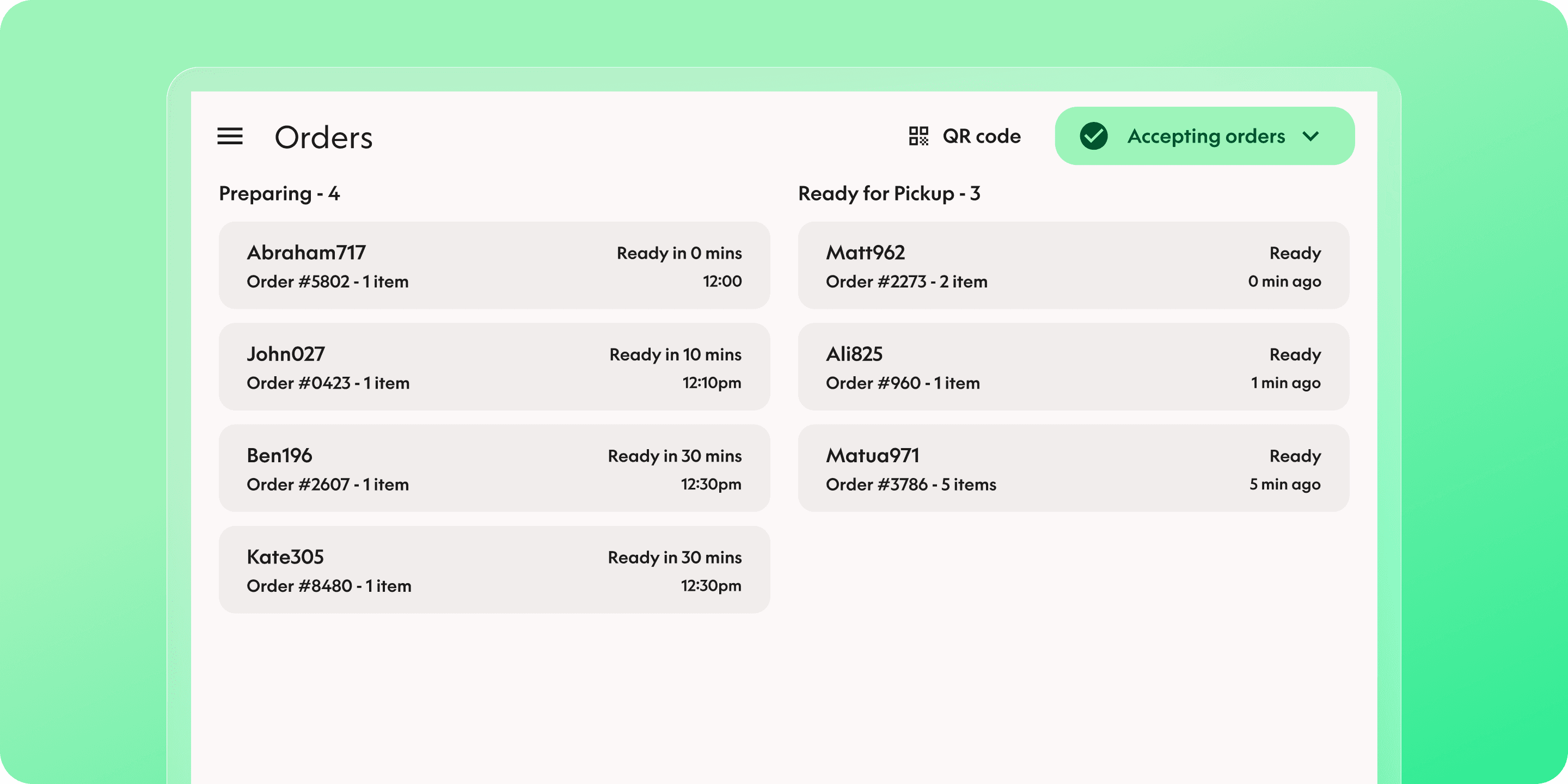
Reframed order visibility and prioritisation
This wasn’t just a layout issue — it was an information hierarchy problem. Staff didn’t need to read every order in full; they needed to scan, prioritise, and act quickly.
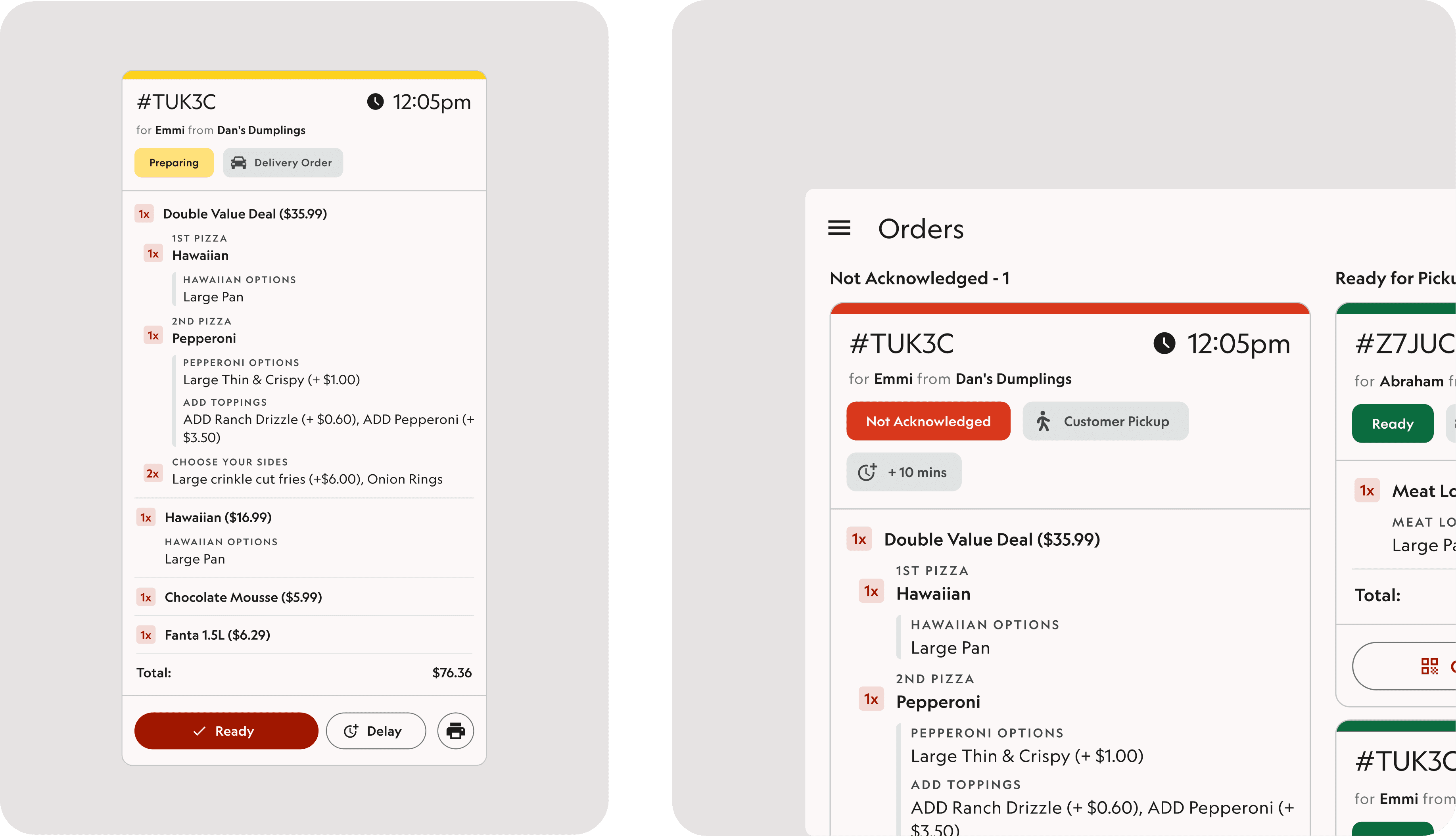
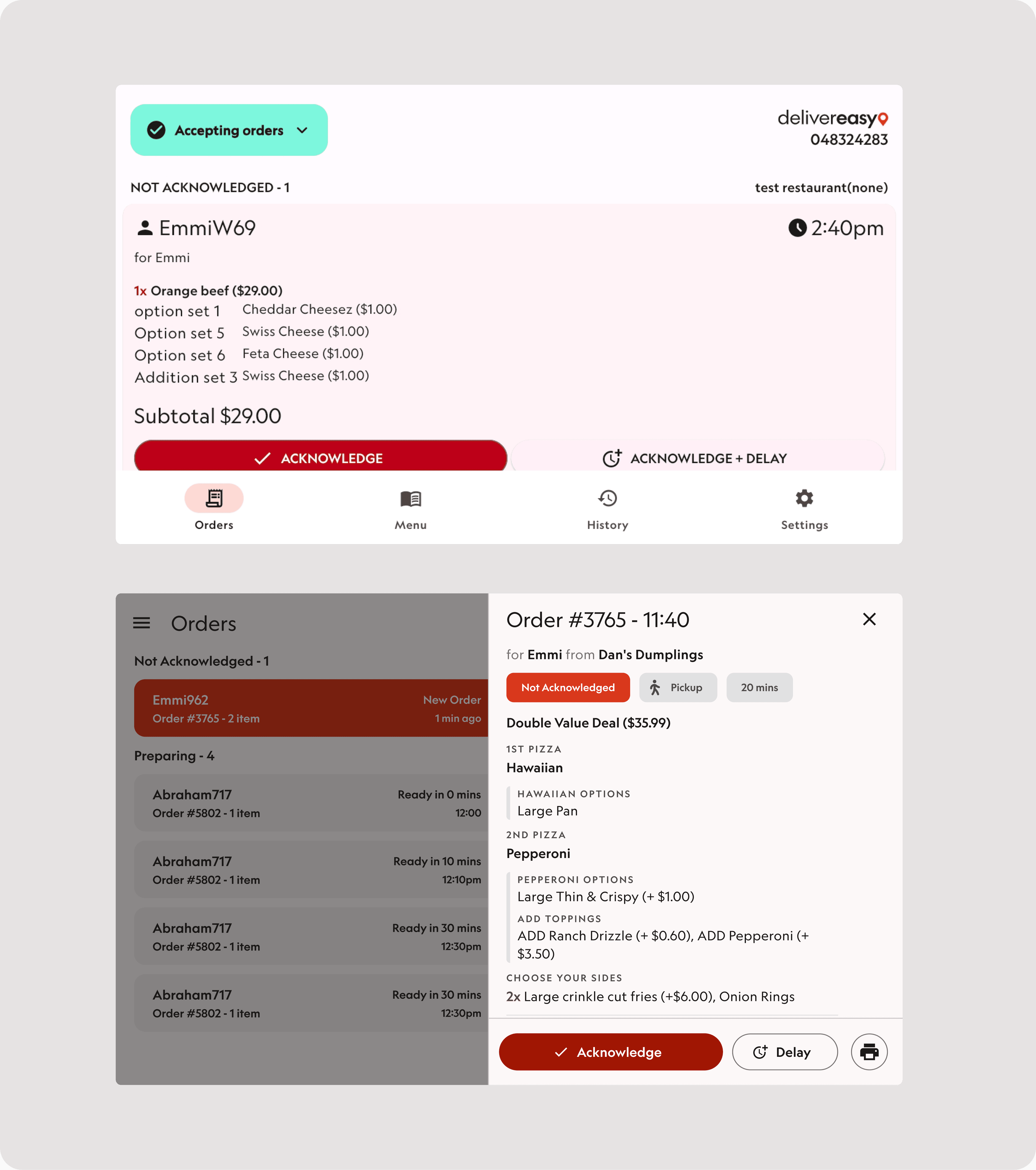
I introduced a dual-layer approach that separates operational overview from detailed order management. Mini cards surface only the most critical information, with full order details available on demand. This reduced visual noise while preserving depth when needed.
The system also supports different operational styles — from expanded-by-default views for print-heavy venues to a streamlined, scan-first experience optimised for high throughput.
Designed for horizontal workflows, not just horizontal screens
Rather than simply rotating the existing UI, I rebuilt the layout for landscape-first usage. A two-column structure separates New/Preparing orders from Ready orders, dramatically improving visibility and reducing scrolling.
This made it easier for teams to manage multiple active orders at once and keep focus on what required immediate action — especially during peak periods.

Clearer states, timing, and safer actions
Order states were made more explicit through improved grouping, visual emphasis, and clearer language. New and unreviewed orders are easy to spot, preparing orders are simple to track, and ready orders are separated to avoid missed handoffs.
Static timestamps were replaced with countdown-based timing, helping teams understand urgency at a glance and make better real-time decisions.

